
Opened 10 years ago
Closed 10 years ago
#329 closed defect (fixed)
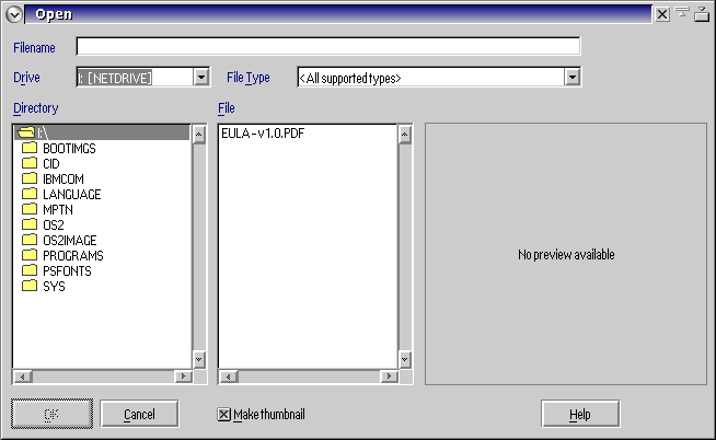
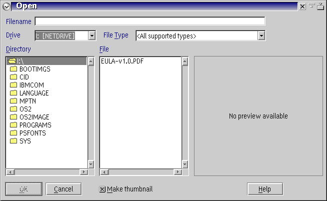
Button and checkbox alignment in FOC could be improved
| Reported by: | Lewis Rosenthal | Owned by: | |
|---|---|---|---|
| Priority: | trivial | Milestone: | 1.4.0 |
| Component: | UI | Version: | 1.4.0 |
| Keywords: | refresh, update, view, monitor | Cc: | ataylor |
Description
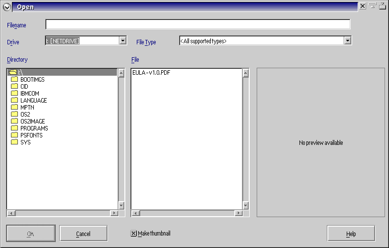
Related to the changes made in #318, the new checkbox and Help button positioning is still not quite right.
Attaching images of current and proposed positioning.
Attachments (9)
Change History (20)
by , 10 years ago
| Attachment: | FOC_button_alignment.png added |
|---|
by , 10 years ago
| Attachment: | FOC_button_alignment_2.png added |
|---|
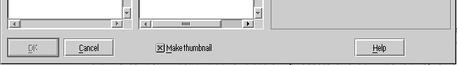
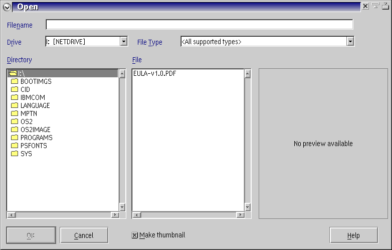
Proposed alignment of buttons and checkbox
comment:1 by , 10 years ago
This is going to be a problem. On my system while the checkbox is about where you show it on the current screen capture my help button is already where you show it on the proposed alignement. I can't move it any further right without taking it off the dialog.
comment:2 by , 10 years ago
Interesting, I just pulled the latest svn and built and my Help button only shows He as the rest of the button is cut off on the right side.
comment:3 by , 10 years ago
I've asked Keith to weigh in on this. I've picked through the PM references I have and even perused some of the PM articles in EDM/2. I'm not finding it, though. My thinking is that we can create a container on top of the file dialog, properly aligned, and place the button in that. That doesn't help with the checkbox, of course.
I suspect this is because my screen res is 1400x1050 and my SNAP settings are:
SET SDDFONTDPI=96
comment:4 by , 10 years ago
If we can't get this perfectly right-aligned for all cases, we should at least move it to the left so that we're not clipping the button.
Can we get this change done in the near future so we can get to GA?
by , 10 years ago
| Attachment: | FOC_button_alignment_small_96dpi.png added |
|---|
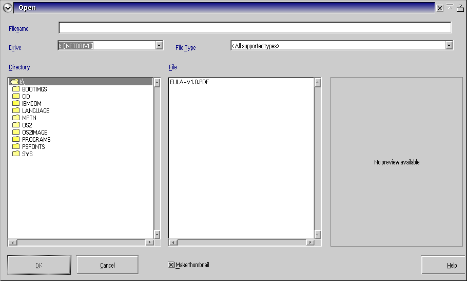
SNAP with SDDFONTSIZE small and SDDFONTDPI 96
by , 10 years ago
| Attachment: | FOC_button_alignment_small_120dpi.png added |
|---|
SNAP with SDDFONTSIZE small and SDDFONTDPI 120
by , 10 years ago
| Attachment: | FOC_button_alignment_medium_96dpi.png added |
|---|
SNAP with SDDFONTSIZE medium and SDDFONTDPI 96
by , 10 years ago
| Attachment: | FOC_button_alignment_medium_120dpi.png added |
|---|
SNAP with SDDFONTSIZE medium and SDDFONTDPI 120
by , 10 years ago
| Attachment: | FOC_button_alignment_large_96dpi.png added |
|---|
SNAP with SDDFONTSIZE large and SDDFONTDPI 96
by , 10 years ago
| Attachment: | FOC_button_alignment_large_120dpi.png added |
|---|
SNAP with SDDFONTSIZE large and SDDFONTDPI 120
comment:5 by , 10 years ago
Almost there. Of my recent tests, it appears that only with SDDFONTSIZE=large is the Help button being positioned too far to the right. In a perfect world, this would align nicely to the right, with the same padding as we have for the OK button on the left, but for now, a little more pull to the left, and we should be fine for release of 1.4.0.
FYI, these recent shots were taken with 1.4.0 RC4 using:
12-17-16 16:51 1,408,130 124 Lucide1.dll
(The bldlevel string, however, still reads: Date/Time: 2016-09-11 03:24:00.)
comment:6 by , 10 years ago
I still haven't automated updating the build level string. I will try to do that in the next few days but failing that I will just update it manually for the release and worry about automating it later. I am going to try right aligning the Help button with files listbox and see how that works.
by , 10 years ago
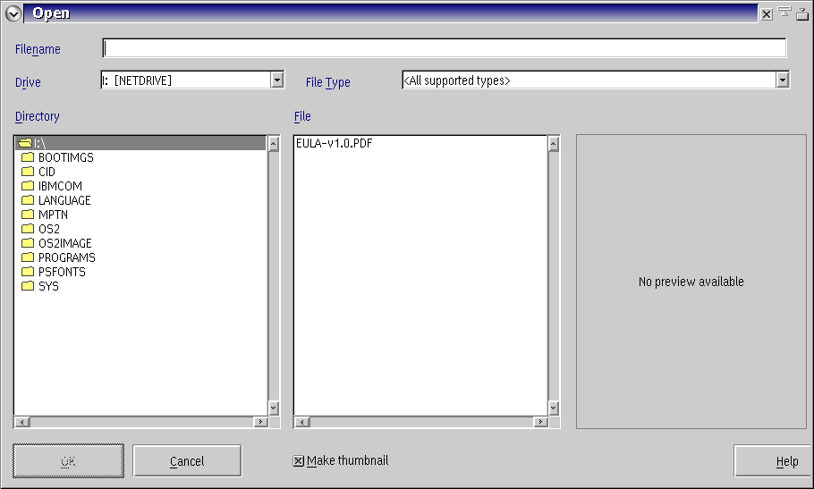
| Attachment: | open dialog help button.png added |
|---|
comment:7 by , 10 years ago
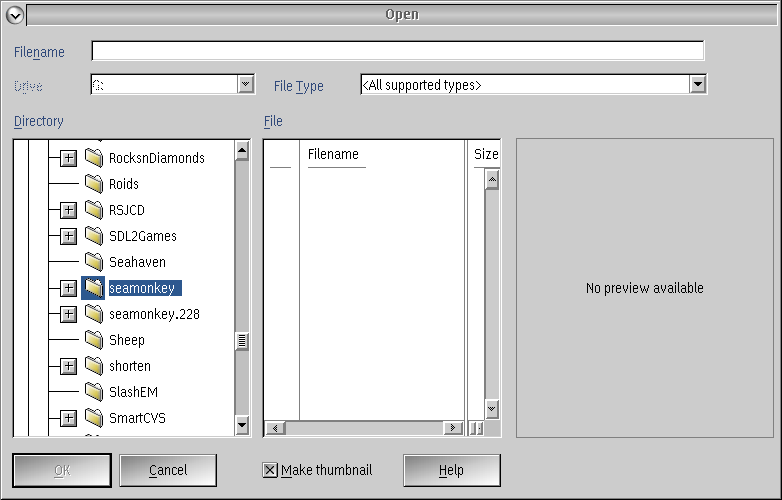
How about this? Maybe it will even stay put on all systems. I noticed the make thumbnail checkbox stayed where it was placed on all of these. My png is panorama at what ever the default is.
comment:8 by , 10 years ago
I could live with that. Please send me the dll and I'll give it a go here with SNAP at a few resolutions.
comment:9 by , 10 years ago
| Cc: | added |
|---|---|
| Keywords: | refresh update view monitor added |
Yes, this latest one works fine, even with SNAP set for SDDFONTSIZE large and SDDFONTDPI 120. My only criticism about the FOC would be that at that scaling, the right border of the preview pane is a little close to the right edge of the FOC, but that's a very, very minor nit, and one we might have just as hard a time fixing as the positioning of the Help button, so I'd say leave it (note the spacing in FOC_button_alignment_large_120dpi.png).
Thanks, Gregg!
comment:10 by , 10 years ago
Don't know what to tell you. There is something about the preview pane that screws up the dialog spacing. I initially figured I had some math error in the spacing. I went in and check first oddity was the preview pane was only set at 24 units wide. It is clearly 120 or more. Also originally the help button should have been partially off the dialog on all screens as it extended beyond the width of the dialog. I fixed these but it did really change anything. I just tried making the dialog 100 units wider that also didn't change anything (same narrow boarder on the right). I have no idea why it behaves this way. Probably not worth worrying about.
comment:11 by , 10 years ago
| Resolution: | → fixed |
|---|---|
| Status: | new → closed |
Agreed 100%.
Closing this as fixed.
Thanks!
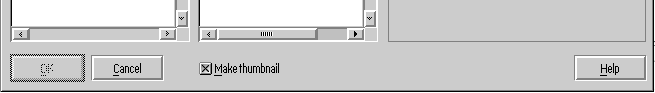
Current button and checkbox alignment, after changes made in #318